
Notice
Recent Posts
Recent Comments
Link
| 일 | 월 | 화 | 수 | 목 | 금 | 토 |
|---|---|---|---|---|---|---|
| 1 | 2 | 3 | 4 | 5 | 6 | |
| 7 | 8 | 9 | 10 | 11 | 12 | 13 |
| 14 | 15 | 16 | 17 | 18 | 19 | 20 |
| 21 | 22 | 23 | 24 | 25 | 26 | 27 |
| 28 | 29 | 30 |
Tags
- Protocol
- 리팩토링
- 리펙토링
- SWIFT
- ios
- Xcode
- 클로드코드
- UITextView
- swift documentation
- uiscrollview
- map
- combine
- Human interface guide
- Clean Code
- UICollectionView
- 스위프트
- Refactoring
- 애니메이션
- MVVM
- tableView
- uitableview
- claude code
- swiftUI
- rxswift
- Observable
- collectionview
- clean architecture
- 클린 코드
- HIG
- RxCocoa
Archives
- Today
- Total
김종권의 iOS 앱 개발 알아가기
[iOS - swiftUI] Toggle, ToggleStyle을 이용한 커스텀 토글 본문
Toggle


- 토글은 Label 타입을 가지고 있는 형태
struct Toggle<Label> where Label : View- 토글을 사용할 땐, 토글이 켜져 있는지 여부를 결정하는 Bool 속성에 바인딩하여 사용
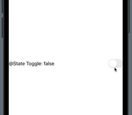
struct ContentView: View {
  @State var toggle1On = false

  var body: some View {
    VStack {
      Toggle(isOn: self.$toggle1On) {
        Text("@State Toggle: \(String(self.toggle1On))")
      }
  }
}
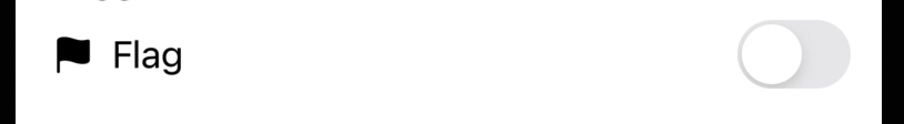
- Toggle 클로저에 Text가 아닌 Label 사용도 가능
Toggle(isOn: self.$toggle5On) {
  Label("Flag", systemImage: "flag.fill")
}
.toggleStyle

- Toggle 인스턴스에 접근하여 스타일을 지정해 줄 수 있는 것
- 대표적으로 3가지 스타일이 있는데 이 중에서 .automatic은 플랫폼에 따라 동적으로 달라지는 스타일
Toggle(isOn: self.$toggle2On) {
  Text("(.automatic style) @Published Toggle: \(String(self.toggle2On))")
}
.toggleStyle(.automatic)

Toggle(isOn: self.$toggle3On) {
  Text("(.button style) @Published Toggle: \(String(self.toggle3On))")
}
.toggleStyle(.button)

Toggle(isOn: self.$toggle4On) {
  Text("(.switch style) @Published Toggle: \(String(self.toggle4On))")
}
.toggleStyle(.switch)
커스텀 토글 만드는 방법

- ToggleStyle 프로토콜을 준수하는 토글을 정의
- makeBody(configuration:) -> some 메소드를 구현
import SwiftUI

struct MyToggleStyle: ToggleStyle {
  func makeBody(configuration: Configuration) -> some View {

  }
}- makeBody 인수인 configuration에서 많은 정보를 가져올 수 있기 때문에 커스텀 토글 구현이 매우 편리
- configuration.label
- configuration.isOn -> on 상태에 따라 ZStack의 alignment를 바꾸어주어 스위칭되는 것처럼 보이도록 구현
struct MyToggleStyle: ToggleStyle {
  func makeBody(configuration: Configuration) -> some View {
    HStack {
      configuration.label
      ZStack(alignment: configuration.isOn ? .trailing : .leading) {

      }
    }
  }
}- ZStack안에 RoundedRectangle을 넣어서 구현
- ZStack안에 사용하는 이유: alignment를 변경하기가 쉬움
- ZStack안의 이벤트 처리는 마지막에 추가된 UI에만 적용하면 되므로 onTapGesture처리가 간편
// 코드 출처: https://swiftui-lab.com/custom-styling/

struct MyToggleStyle: ToggleStyle {
  private let width = 60.0

  func makeBody(configuration: Configuration) -> some View {
    HStack {
      configuration.label
      ZStack(alignment: configuration.isOn ? .trailing : .leading) {
        RoundedRectangle(cornerRadius: 12)
          .frame(width: width, height: width / 2)
          .foregroundColor(configuration.isOn ? .green : .red)

        RoundedRectangle(cornerRadius: 12)
          .frame(width: (width / 2) - 4, height: width / 2 - 6)
          .padding(4)
          .foregroundColor(.white)
          .onTapGesture {
            withAnimation {
              configuration.$isOn.wrappedValue.toggle()
            }
          }
      }
    }
  }
}- 사용하는쪽
Toggle(isOn: self.$toggle6On) {
  Text("My Toggle")
}
.toggleStyle(MyToggleStyle())
* 전체 코드: https://github.com/JK0369/ExToggle-SwiftUI
* 참고
https://swiftui-lab.com/custom-styling/
https://developer.apple.com/documentation/swiftui/togglestyle
'iOS 기본 (SwiftUI)' 카테고리의 다른 글
| [iOS - SwiftUI] DatePicker, ColorPicker 사용 방법 (0) | 2022.08.20 |
|---|---|
| [iOS - swiftUI] Picker, PickerStyle 사용 방법 (2) | 2022.08.17 |
| [iOS - swiftUI] EditButton 사용 방법 (0) | 2022.08.09 |
| [iOS - swiftUI] ButtonStyle을 이용한 커스텀 버튼 구현 방법 (ButtonStyle, PrimitiveButtonStyle) (0) | 2022.08.06 |
| [iOS - swiftUI] Button, ButtonStyle 사용 방법 (0) | 2022.08.05 |
'iOS 기본 (SwiftUI)' Related Articles
more


Comments